
Hello friends welcome to Tech Punch.
In this blog we will learn about what is material design ?
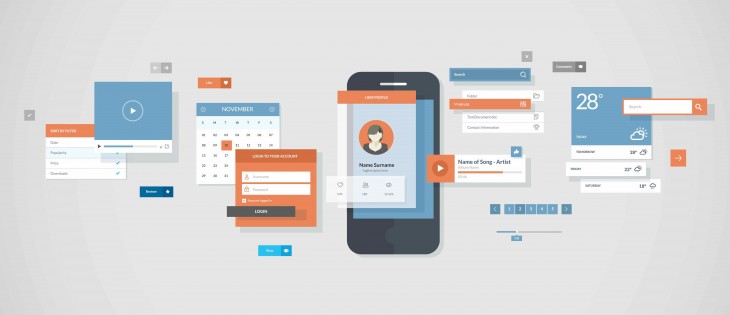
Material Design is a set of UI components that helps you build Android apps with Material Design.
- History of material design
Material Design was introduced in 2014. At that time, there was little to no official support from Google for us Android Developers.
On one hand, we had Material Design in all its vibrancy, robust principles and eye-catching animations. On the other hand, we didn’t receive any official support on how to implement all of that.
But all that changed gradually over a year.
Support libraries steadily improved. AppCompat supported basic color theming. Even common widgets were ‘Materialized’. They were also made backward-compatible.
- Popular material components
Popular Material Design Components such as Snackbar, FAB, Navigation Drawer and more could be easily used. Moreover, patterns like Quick Return, Collapsing Headers were made possible, all through XML. All it takes is one line to enable the animation. That’s brilliance, at its finest!
- How to add material library
dependencies {
    //...
    Implementation 'com.android.support:design:27.3.1'
    //...
}
Be sure to replace 27.3.1 with the latest Support Library version. The Test Revision is 28. Without material design library your project is nothing.
Benefits:
1. Easy to use
All Material Components can be easily used just like any normal UI widget in Android. Moreover, as I mentioned above, performing on-scroll animations takes only one line of XML. You don’t even have to touch Java.
I’ll show you how to do all of this, later in this article.
I’ll show you how to do all of this, later in this article.
2. Backward Compatibility
Remember how we all struggled with maintaining consistency using Material Design? I remember it, crystal clear. Doing anything Material, pre-Lollipop was a nightmare!
But the Design Support Library offers is compatible back to Android 2.1. Sweet!
Honestly, the only difference I see is the lack of elevation (depth) on pre-Lollipop. But there’s a simple fix for that too. There’s a way to show elevation shadows on pre-Lollipop.
But the Design Support Library offers is compatible back to Android 2.1. Sweet!
Honestly, the only difference I see is the lack of elevation (depth) on pre-Lollipop. But there’s a simple fix for that too. There’s a way to show elevation shadows on pre-Lollipop.
3. Respects Material Design Guidelines
The library is officially by Google’s Android team. All components strictly follow and respect Material Design guidelines. Each Material Component looks and behaves the way it’s supposed to. So you don’t have to worry about anything that may be amiss.
Also, you can easily tint your Material Component to match your brand color.
Also, you can easily tint your Material Component to match your brand color.
Material Components – Index
The Design Support Library gives us a many to use components. We can even style them to match our brand theme. Here’s a list of all the Material components it offers for us Android developers to use.
You can treat this list as an index to navigate this entire article.
You can treat this list as an index to navigate this entire article.
Important Classes
- CoordinatorLayout
- Behaviors
Android Material UI Components
- Bottom Bar Navigation
- Bottom Sheet
- Floating Action Button (FAB)
- Floating labels (for EditText)
- Material Design Tabs
- Navigation Drawer
- Snackbar
Animations
- Quick Return
- Flexible Space with Image
- Parallax Scrolling (header)


No comments:
Post a Comment